NEW HIT – Hotel International Tirana
TYPOLOGY: Hotel
COUNTRY: Albania
CITY: Tirana
YEAR: 2016-2025
ARCHITECTS: BOLLES+WILSON with Atelier 4
PHOTOS: © BOLLES+WILSON
New HIT was the working title of this project for the Albanian investor Mr. Ram Geci – it has now been franchised to the INTERCONTINENTAL hotel chain.


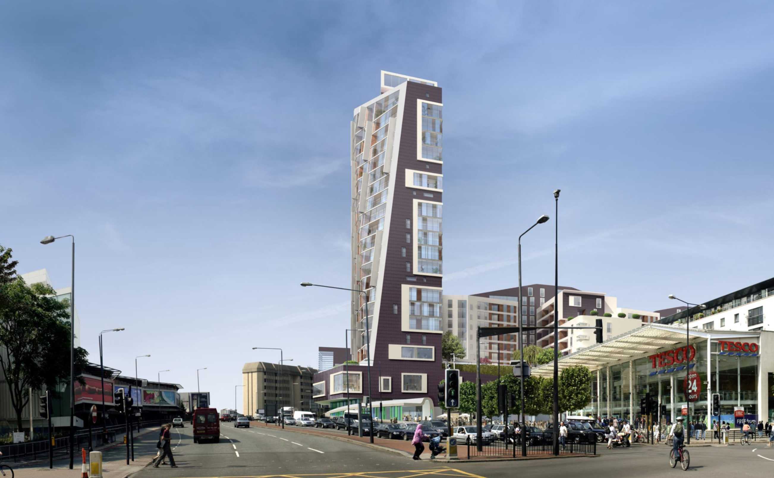
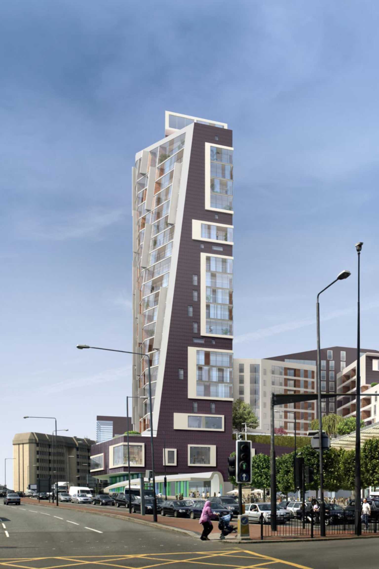
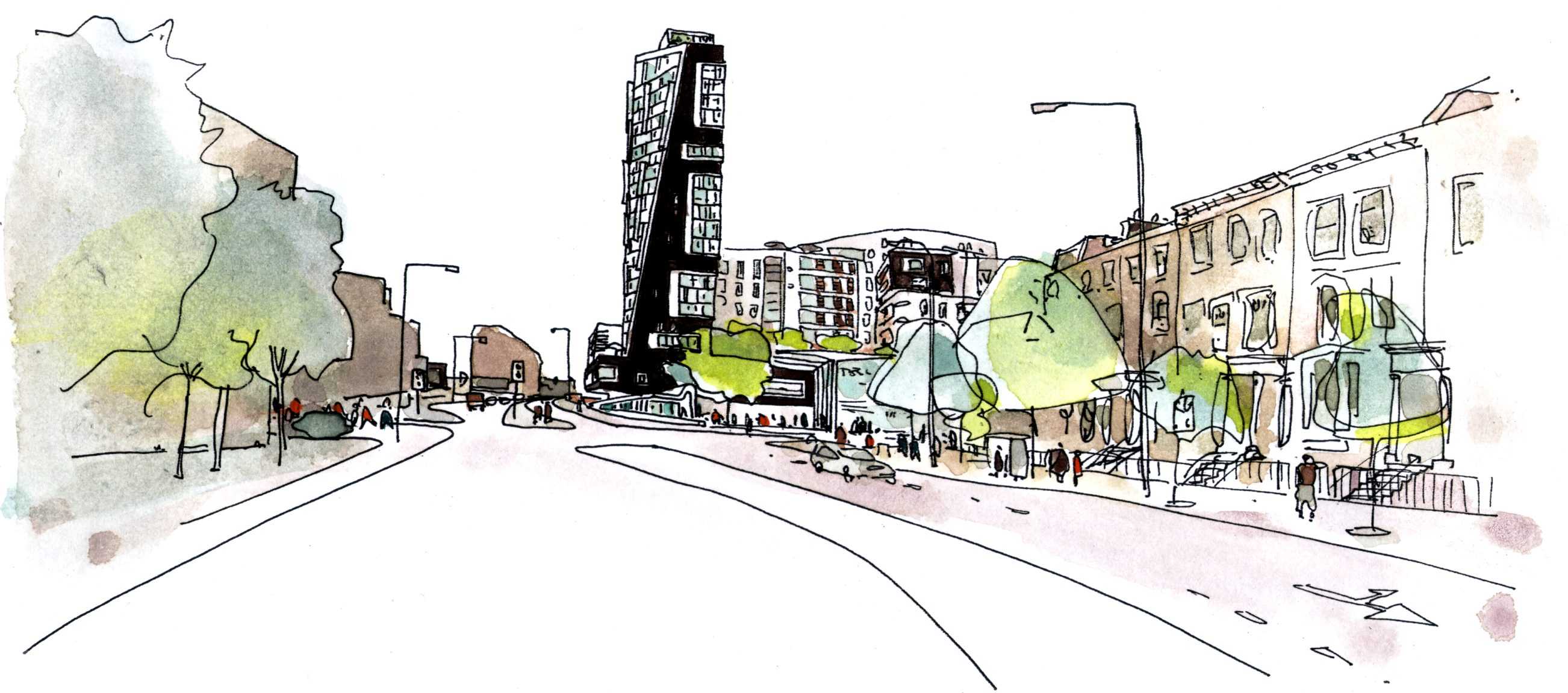
100 West Cromwell Road
TYPOLOGY: Mixed Use
COUNTRY: UK
CITY: London
YEAR: 2008
CLIENT: Brookfield Development (UK) LTD, TESCO Stores Limited
PHOTOS MODEL: © Julian Vogt
The raked tower silhouette terminates the wide street axis for those exiting London westward. At its base the tower extends horizontally, a Fitness Arm (window to pool) frames the Tesco Plaza. The E Form begins at the third floor concourse, above existing carpark decks. The south elevation is glazed (winter gardens); the east and west are dark rippled ceramic.
Community Use: The inclusion of an additional swimming pool for the sole use of the local community has increased the Gross Internal Area of the community facility by some 30%. A Community Trust will be established to manage the pool and associated facilities.


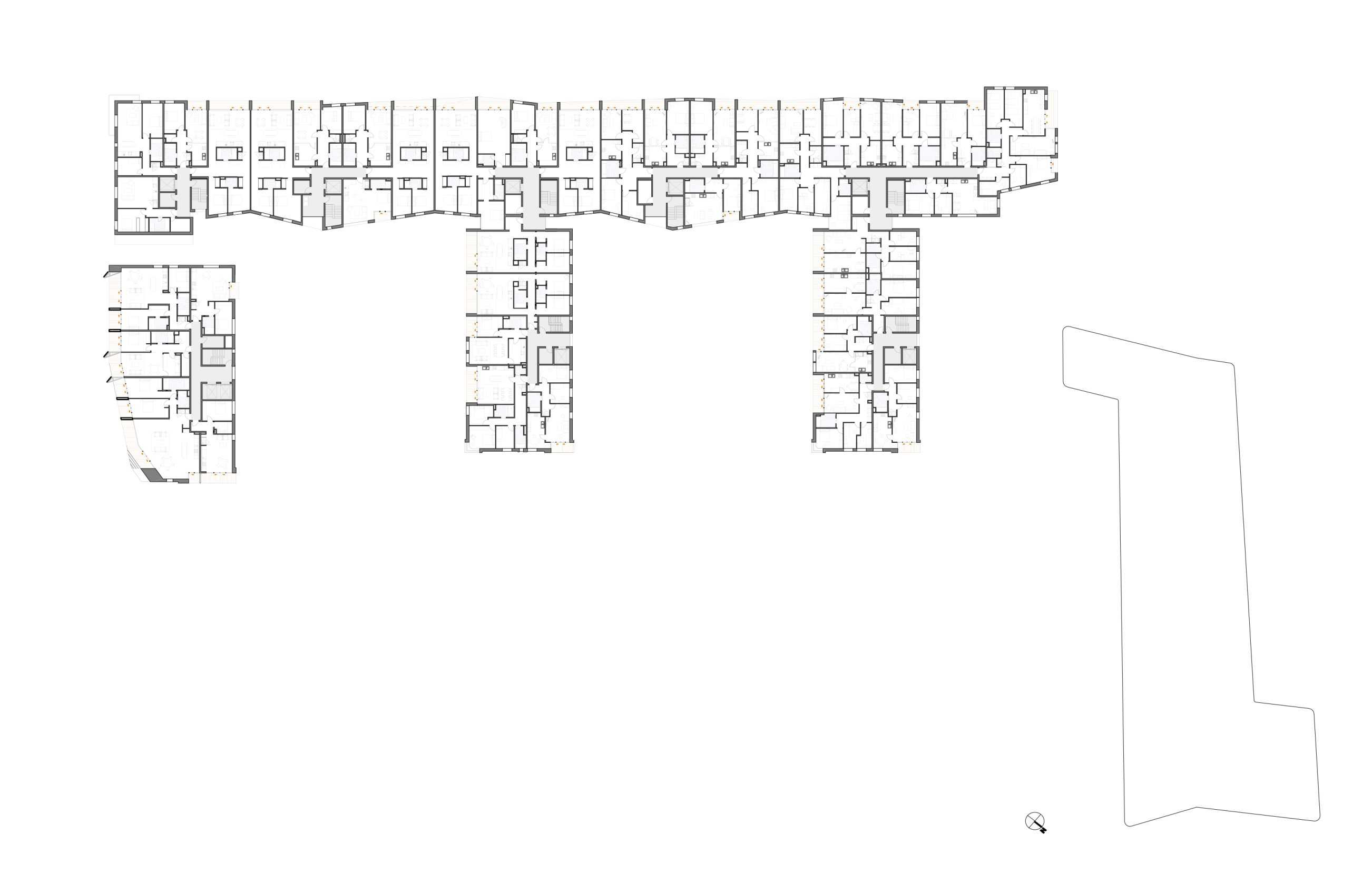

Rationalist Apartments
TYPOLOGY: Residential
COUNTRY: Albania
CITY: Tirana
YEAR: 2009
An eight floor building axially adjacent to the University ensemble – the axial focus of Tirana’s 1930’s Italian Masterplan.
Mass is emphasized, balconies internalized as loggias. Materials are reduced to those fitting historical precedent and the current possibilities of construction in Tirana. The particular ‘haptic’ of the base is achieved with wide mortar joints and intentionally irregular layers of broken (reject) tile fragments.


Von-Galen-Grundschule
TYPOLOGY: Competition / School
COUNTRY: German
CITY: Gescher
YEAR: 2023
COMPETITION: Closed competition, 3rd Prize
COLLABORATOR: wbp Landschaftsarchitekten GmbH, Bochum
GFA: 4.117 sqm
CLIENT: Glockenstadt Gescher
The design carefully combines the historic building fabric with a modern extension. The existing façades are preserved and linked by a central, wedge-shaped structure that forms the heart of the school with its cafeteria, auditorium, and foyer.
All areas are fully accessible, with outdoor spaces clearly defined: a large playground to the north, a nature-oriented learning zone to the southwest, and a green entrance courtyard to the southeast. The foyer serves as a central meeting point and hub, connecting classrooms, multipurpose spaces, and flexible learning areas.
The new building respects the historic architecture while reinterpreting its language in a contemporary way—creating a school that is open, functional, and identity-shaping for students, staff, and the city of Gescher.


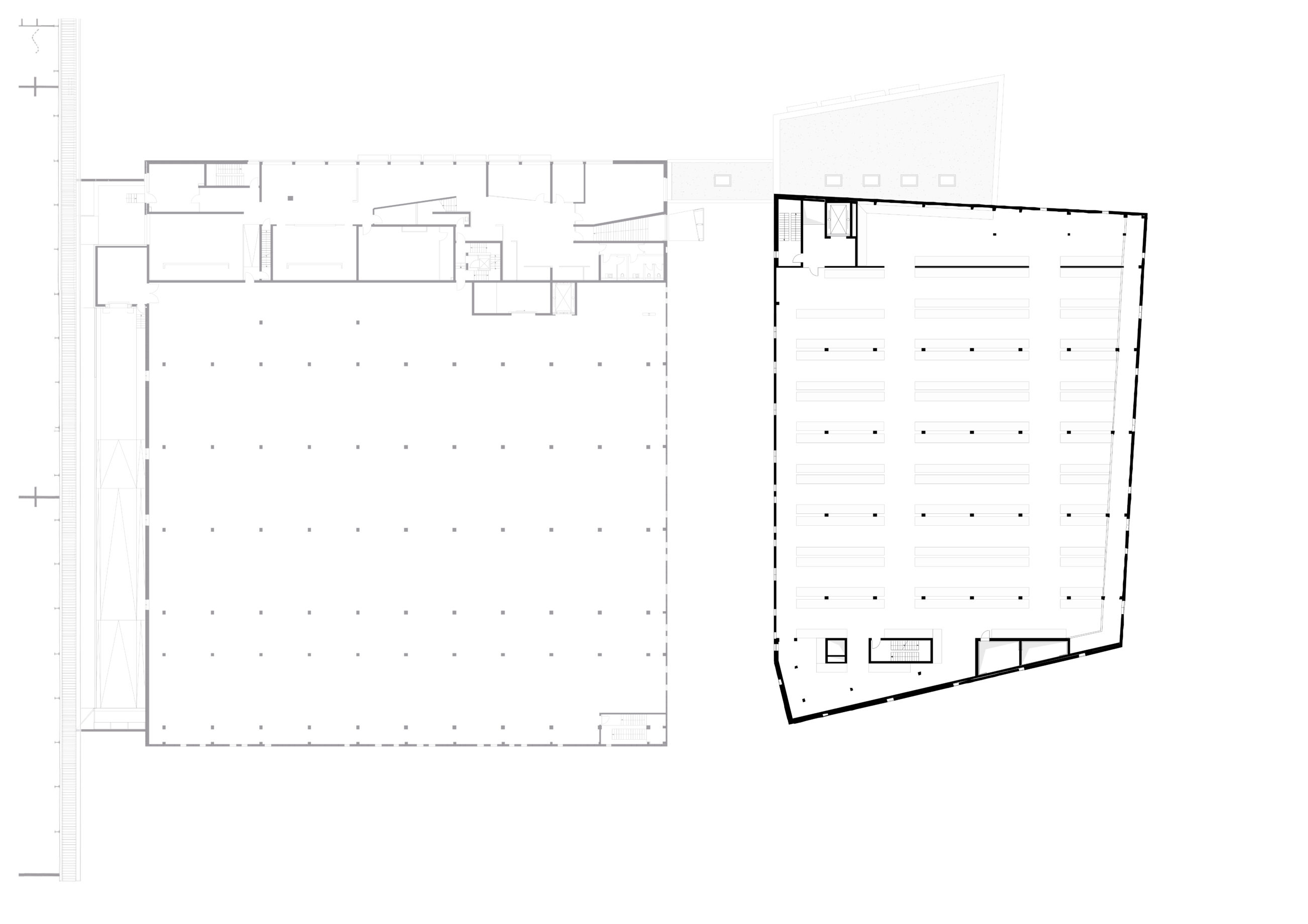
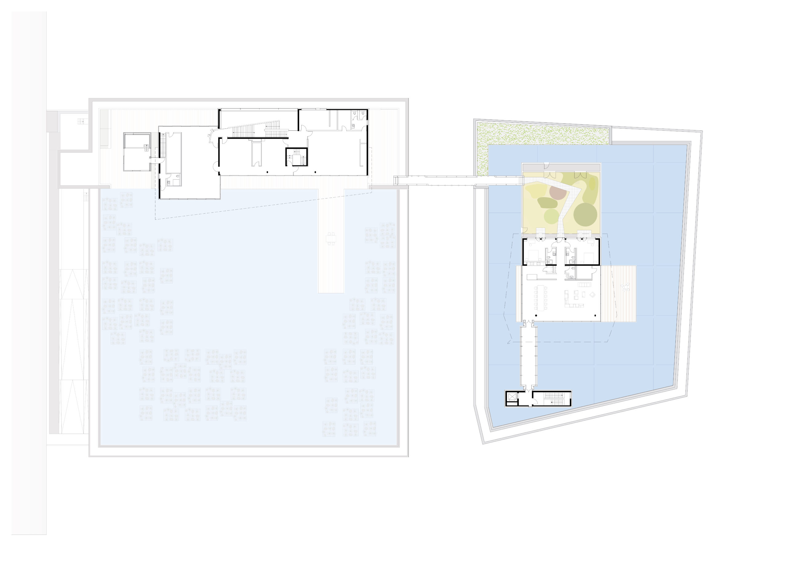
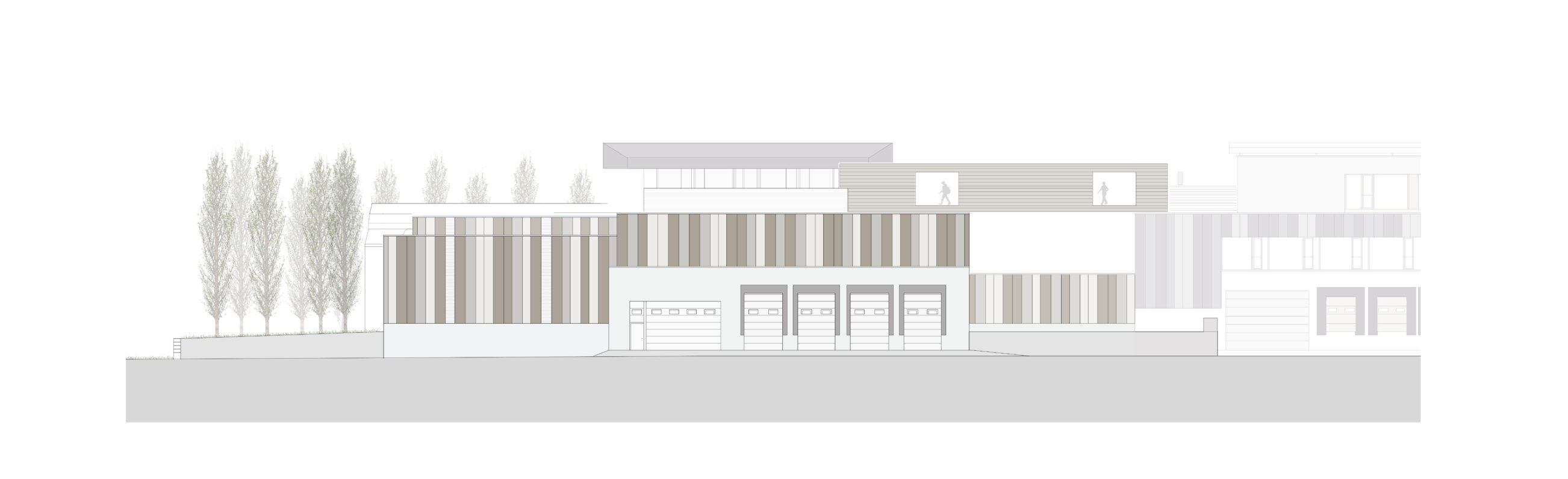
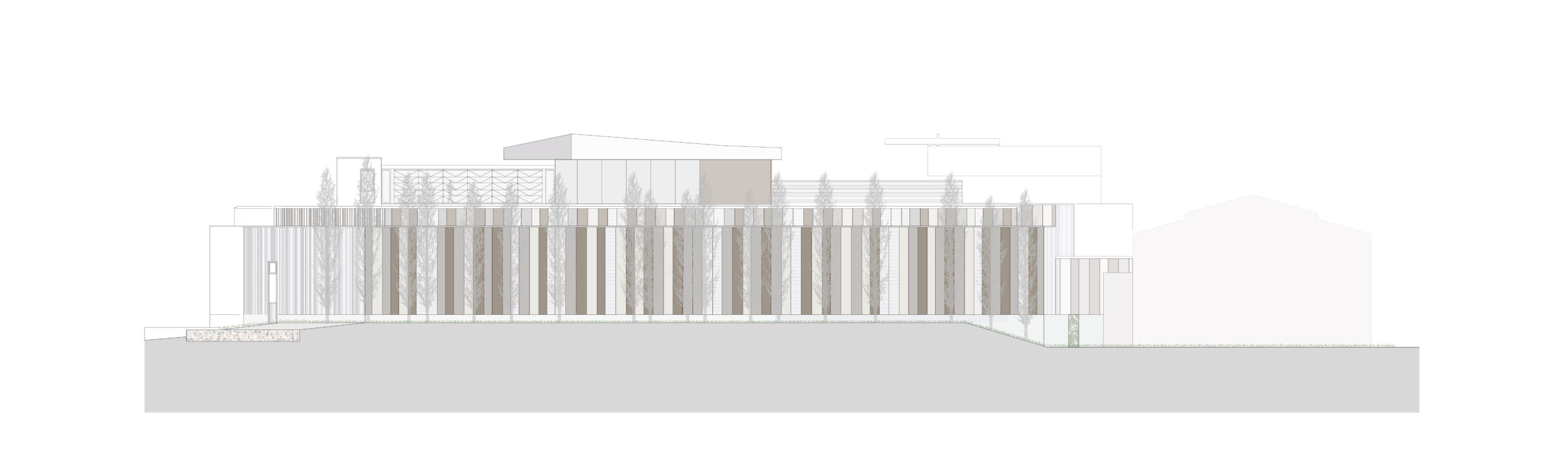
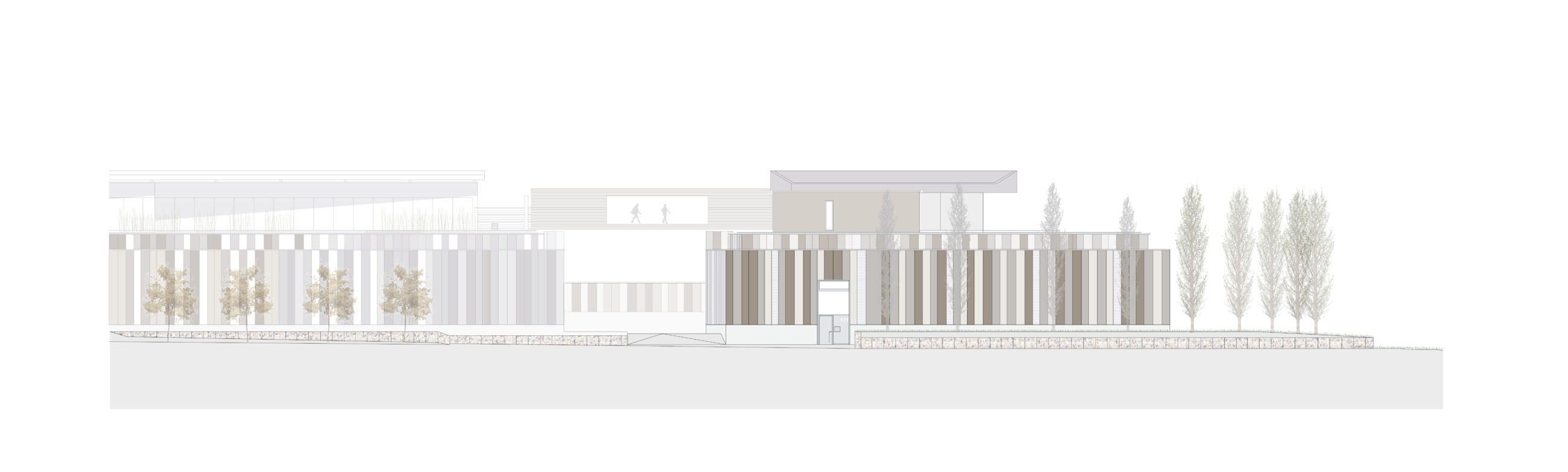
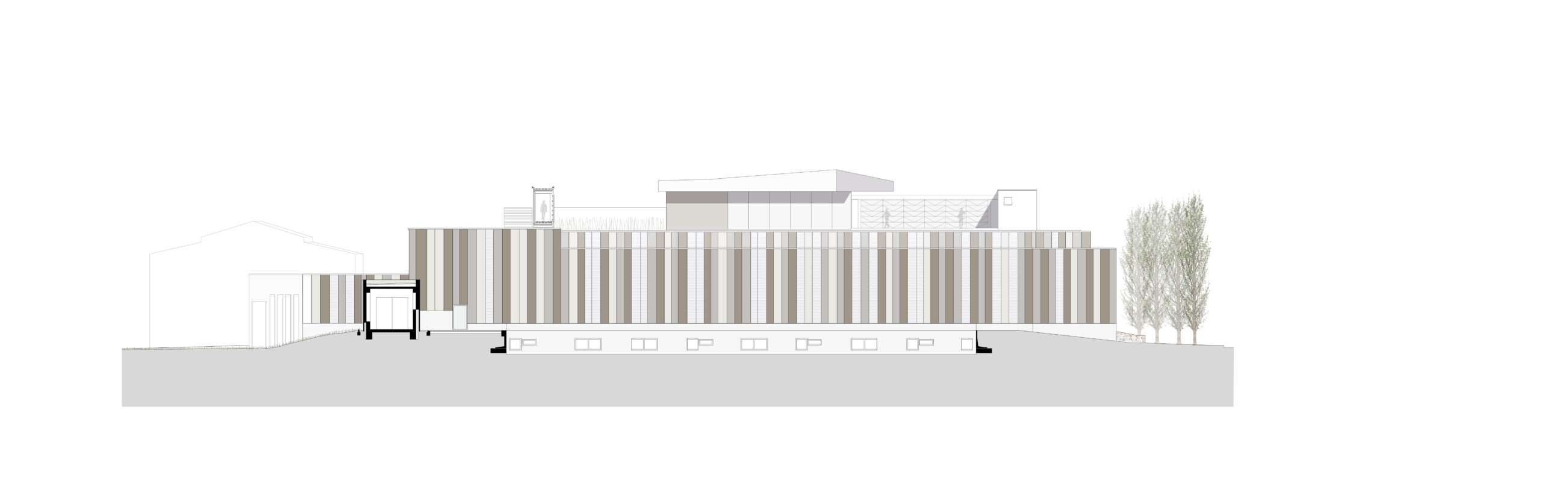
RS+Yellow Distribution – Phase 3
TYPOLOGY: Office, Residential
COUNTRY: German
CITY: Münster
YEAR: 2018
GFA: 2.600 sqm
CLIENT: Rainer Scholze
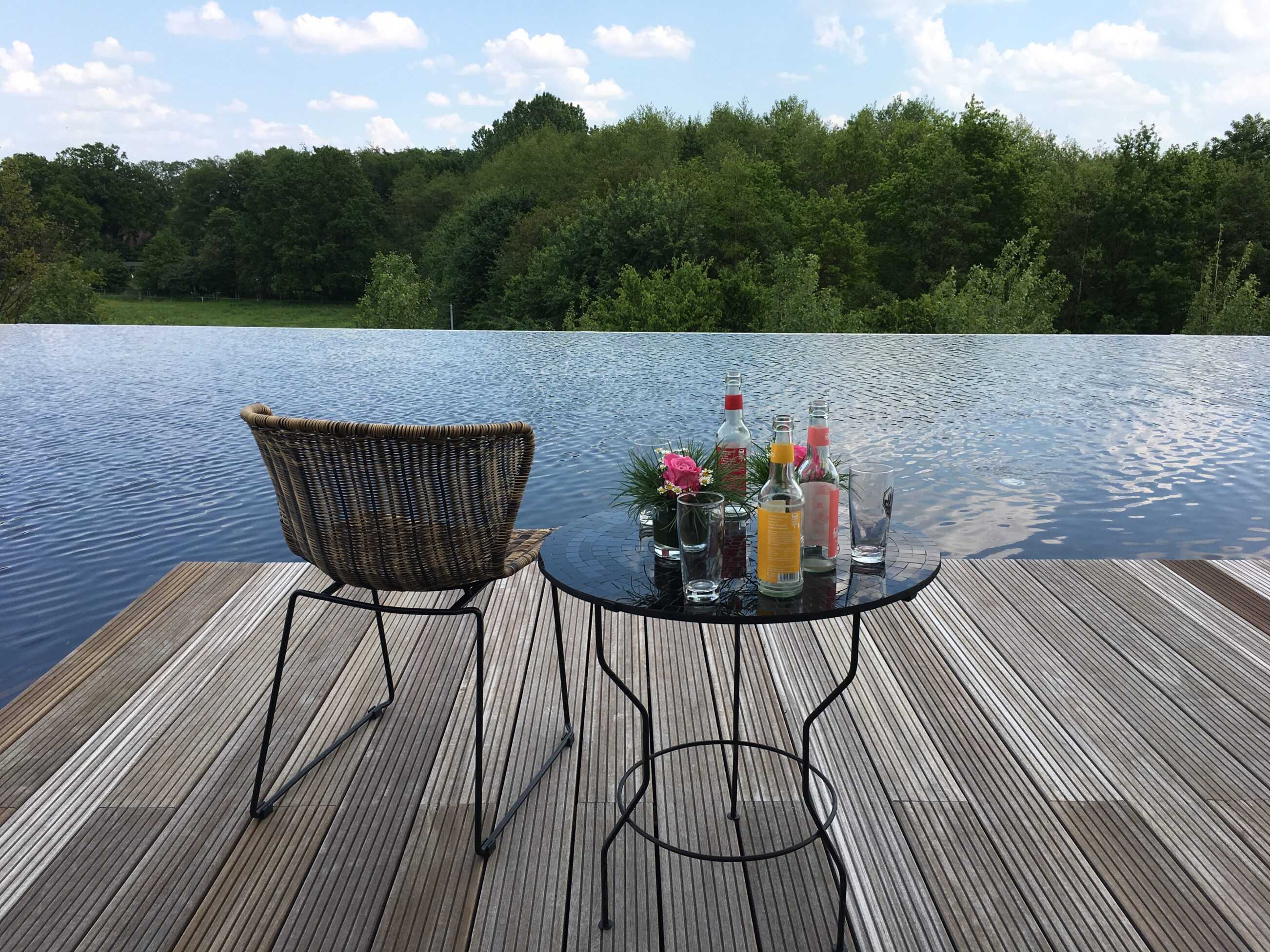
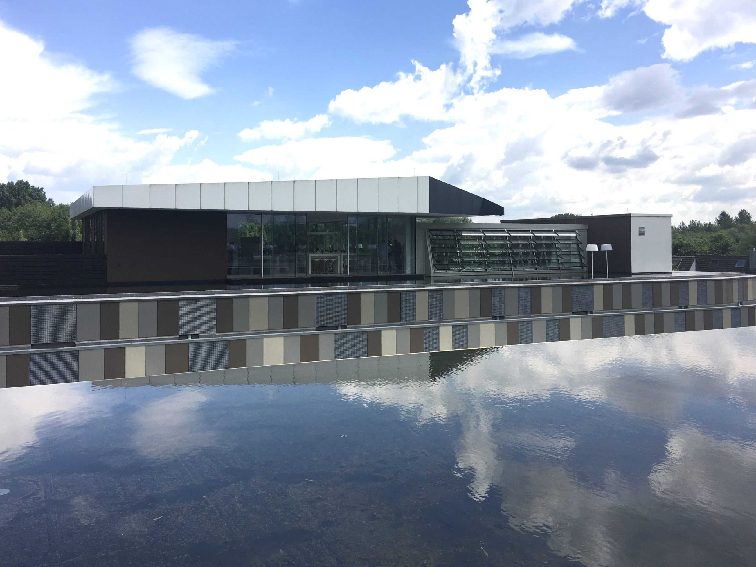
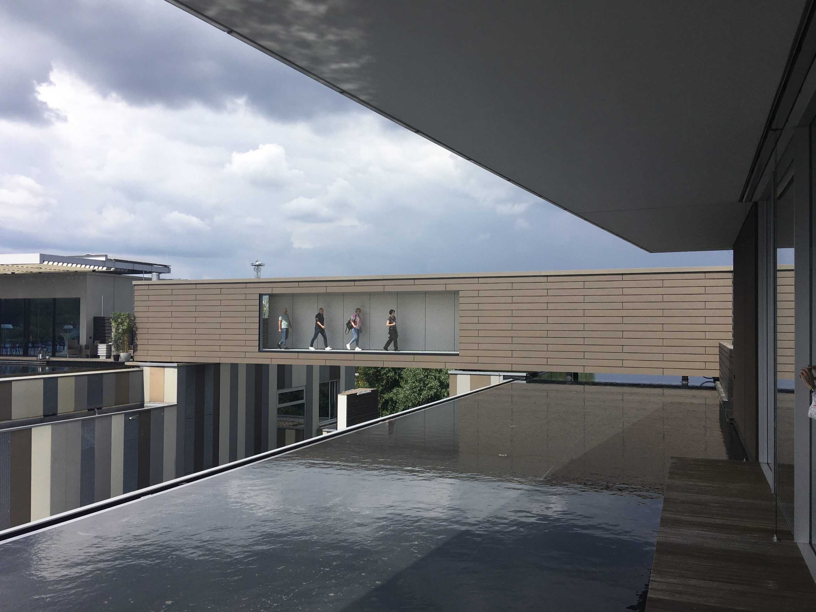
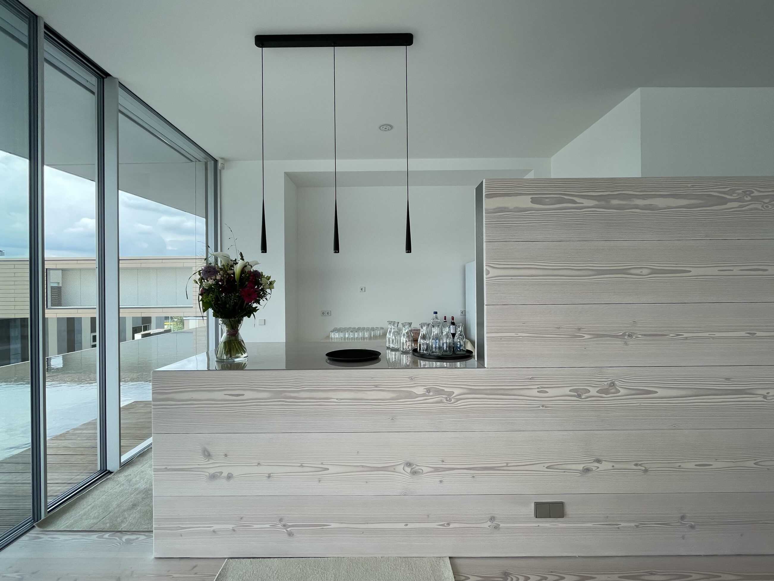
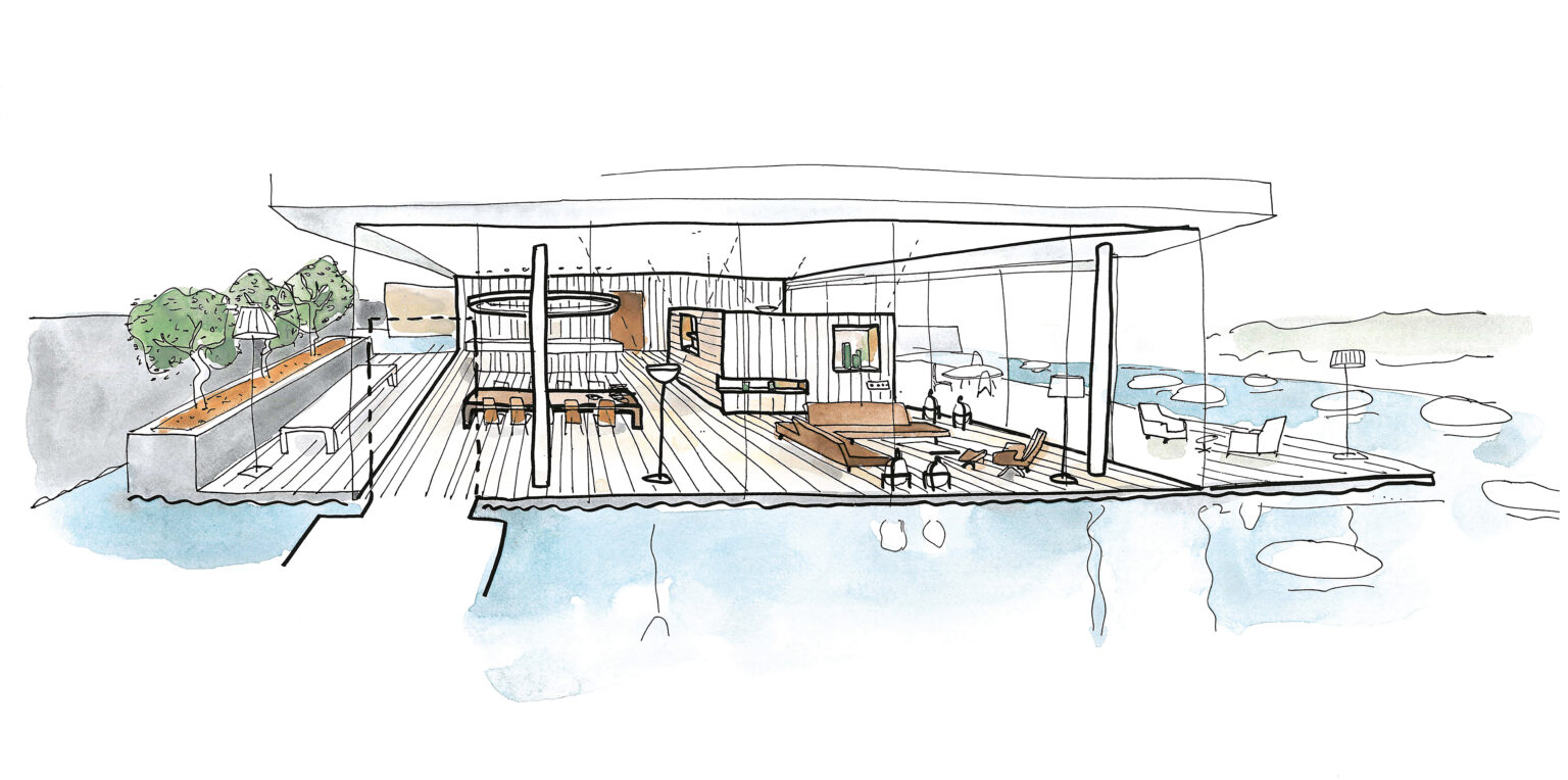
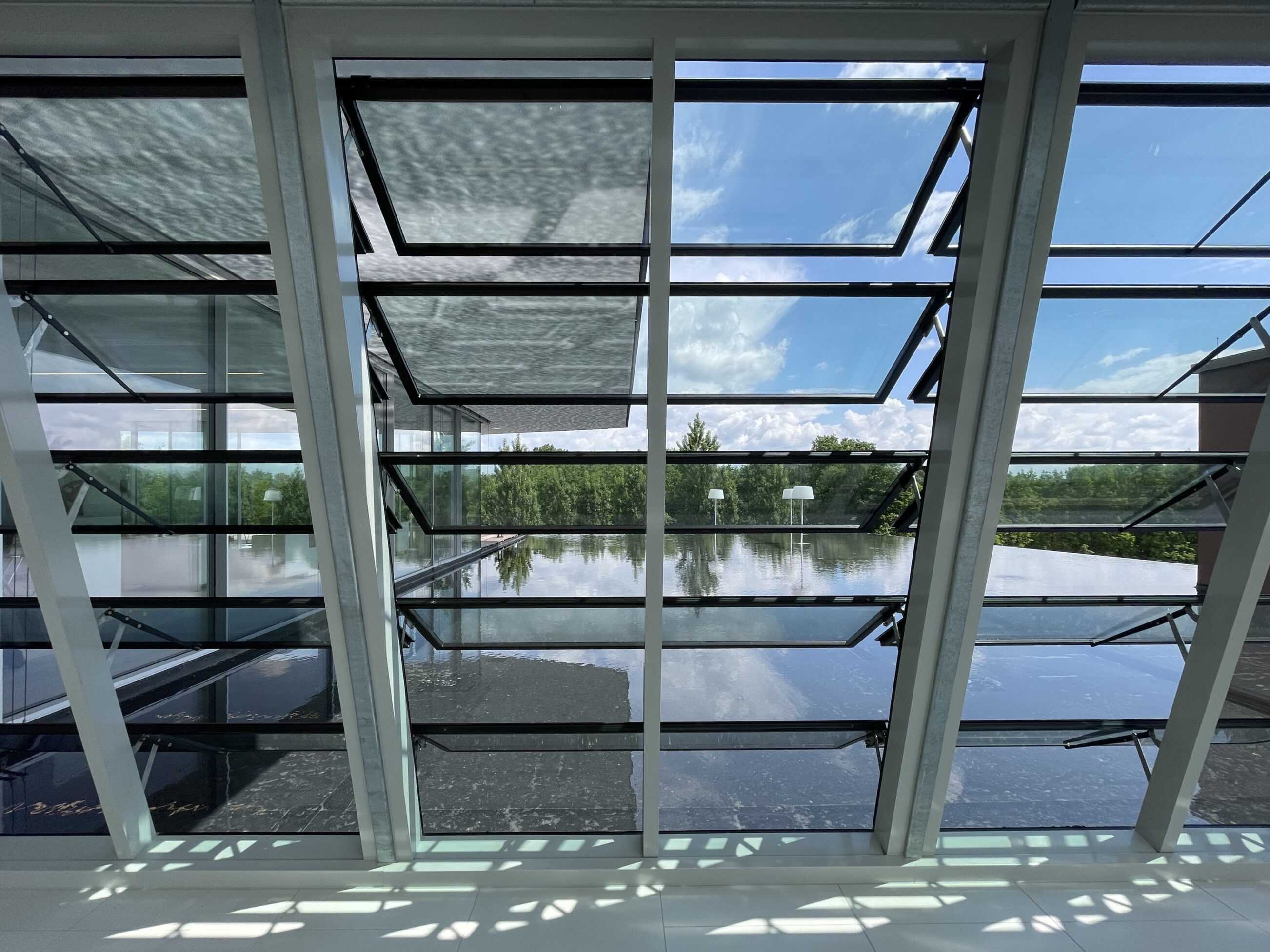
The big box warehouse provides a monumental podium for an enigmatic folded form hovering above the (unseen from the street) water roof.The primary function is obviously storage, three levels of furniture to be distributed to the Germany wide network of RS+Yellow outlets. Pajama striped aerated-concrete façade panels are interspersed with vertical smoke vents. Such vents are usually found on the roof of this pragmatic typology but here the roof (like in RS+Yellow Distribution – Phase 2) is flooded – an infinity pool, based on those seen by the client in South East Asia where he regularly travelled buying furniture. His plan was not only to work every day gazing out across his dreamlike waterscape, but also to spend his nights hovering above the rooftops of an unsuspecting Münster, Villa and Office Pavilion are thus connected by a bridge-box. Tragically Rainer Scholze did not live to see his vision complete. His private suite was not constructed and the living spaces now function as meeting and conference rooms for the co-operative he set up for his employees.


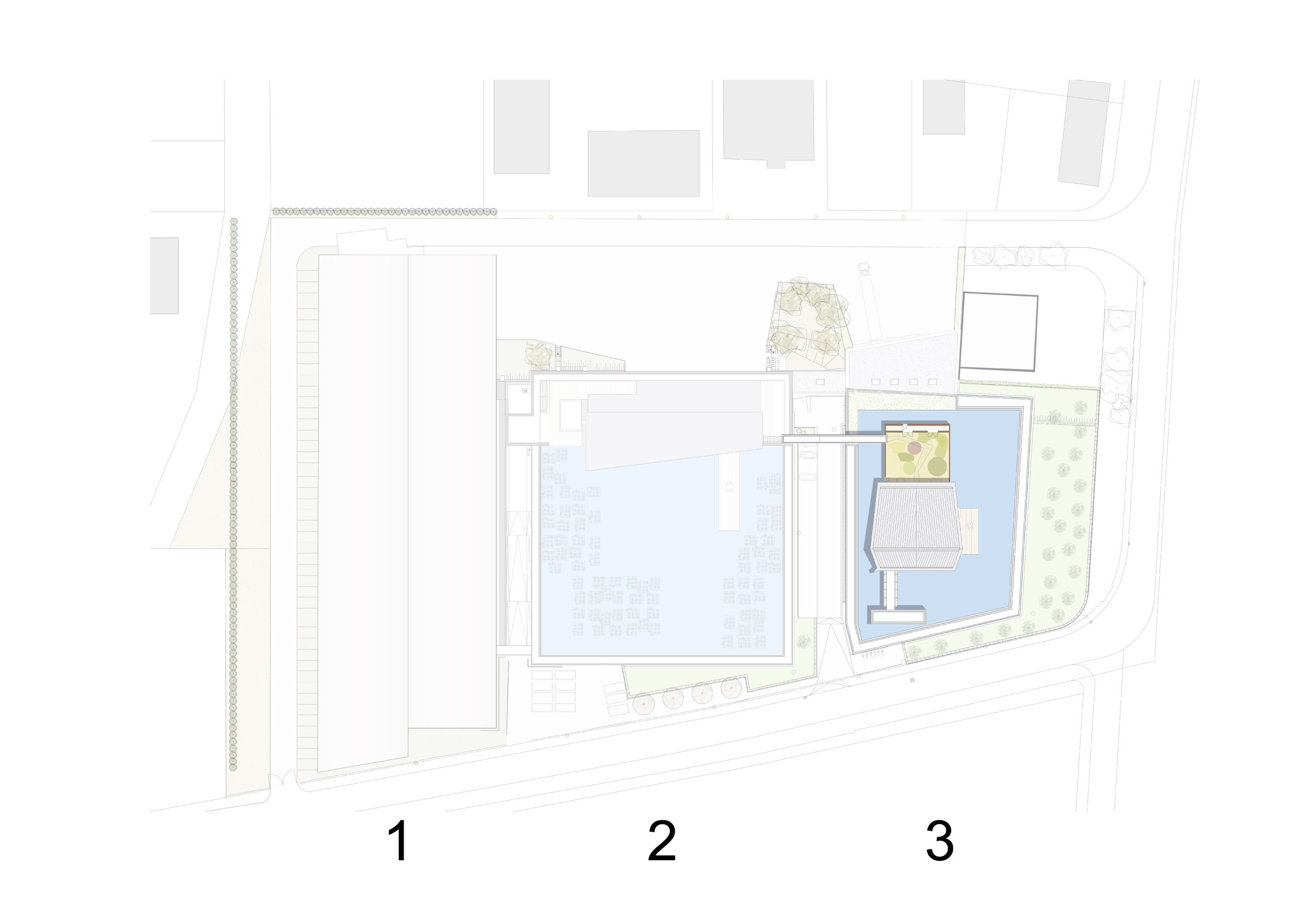
2: RS+Yellow Distribution - Phase 2
3: RS+Yellow Distribution - Phase 3